Webpage layout & SEO Design Guide
- Home
- Knowledge Sharing
- Webpage layout & SEO Design Guide
A website's layout is a carefully structured arrangement of various elements such as images, headings, subheadings, tables, infographics, and text. These elements are organized using the HTML markup language and CSS, which are the building blocks of any website's design.
Developers and owners alike are often concerned about their site's appearance. However, after launch, owners want their new site to bring them customers and increase traffic.
Therefore, after a while, we again have to contact the developer with a new TOR on the internal optimization of the site, and the developer, in turn, has to redo their work. Without internal optimization, it won't matter how the site looks from the outside, so optimization must be done both inside and out.
This article will cover everything a developer, layout designer, and SEO designer needs to know. We'll also look at the main mistakes in SEO layout and what you need to do to avoid them.
SEO Website Layout
Imagine your website as a puzzle, with each element code being a piece. SEO website layout involves the strategic arrangement of these pieces on your site's pages, a structure that can significantly impact your search engine promotion.
In other words, there are rules of SEO layout that should be adhered to when developing a website. Competent internal optimization will allow your site's pages to be indexed and ranked faster in searches, and make them more relevant to search queries.
SEO Layout: Design Requirements
The following requirements should be fulfilled on the layout design:
- Prescribe styles for h1-h3 headings.
- Provide tables for the appearance of lists (numbered and labelled).
- Hyperlinks with anchors (link text) and without, and highlight the text and place accents.
- Write the text - it should be displayed correctly using all CSS styles.
- Place links in the menu. Avoid pictures and flash animations.
- Take care of menu scaling. When rendering the menu, you need to consider its potential expansion.
- Place links to important site sections using buttons.
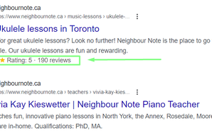
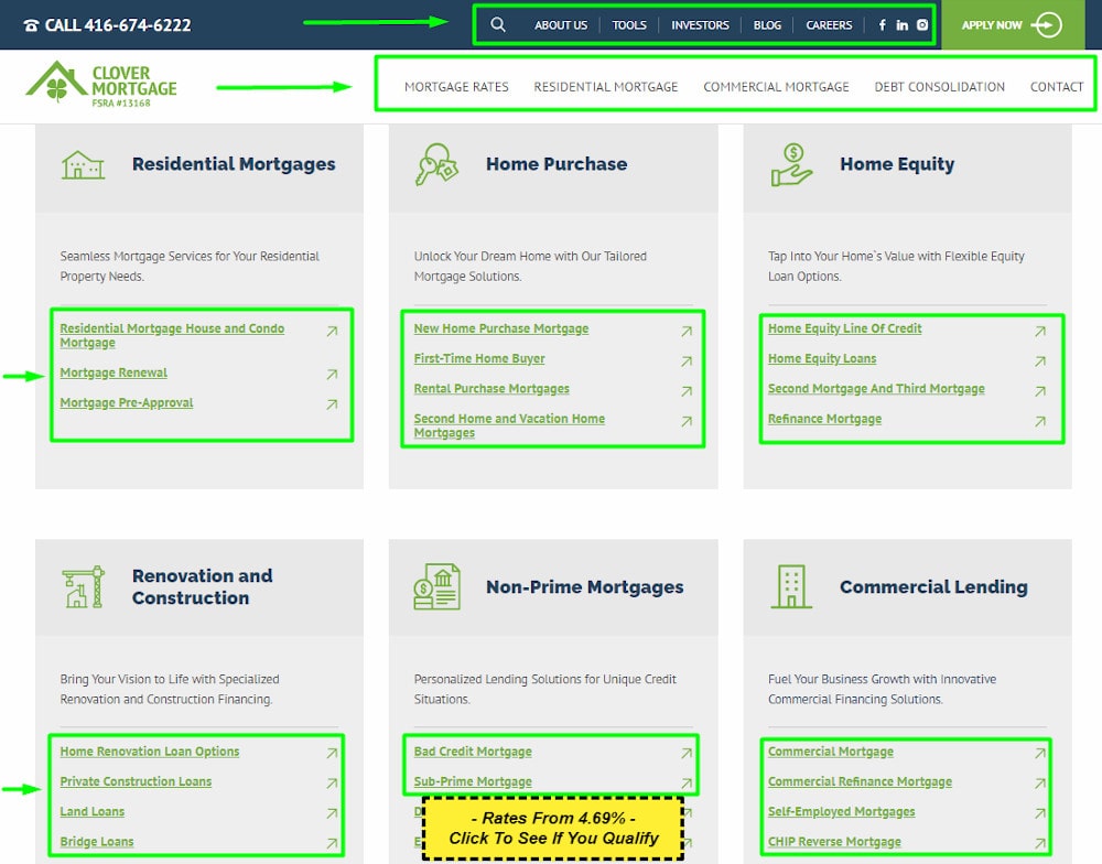
Example of a page on which developers and SEO specialists did work:
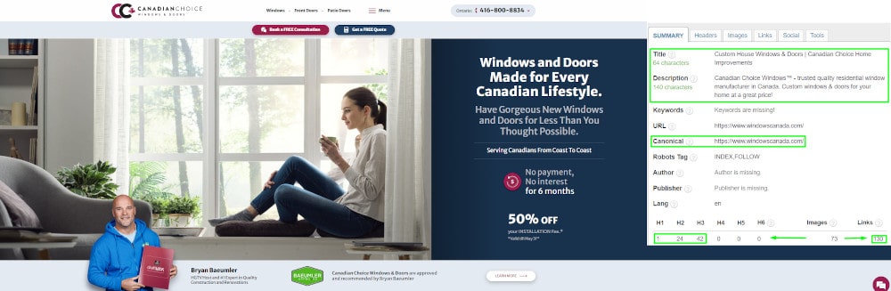
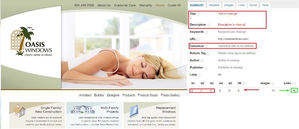
Example of a page that only developers worked on:
How do Search Engines Evaluate Website Design?
Search algorithms work simultaneously in two different directions: anti-spam, and optimization. The first removes points from a site for non-compliance, while the second, on the contrary, accrues bonuses for compliance.
Based on the result, the page receives a "weight," which directly affects its position in Google's search engine.
The term ''site-doorway'' refers to a spam site that automatically generates content for a search query and redirects the user to another web resource. It's important to note that these doorways are created in large numbers, making developing a unique design for each impractical. Recognizing and avoiding such practices is essential for maintaining a reputable online presence.
Positive characteristics also play a significant role in SEO. As these traits, such as site attendance, depth of browsing, and positive user behaviour emerge, optimization systems gain confidence – this paves the way for the site to rank higher in low-frequency queries. Once a substantial number of positive scores are accumulated, suspicions are dispelled, and the site's promotion becomes more effective.
Factors for which search engine robots increase the level of trust in a site include:
- Unique design.
- “ Age" of the site: the period since domain registration.
- User activity: whether they read texts, make purchases, leave comments, or find what they seek.
- Interaction with social networks.
- Data from directories and advertising offices in the search network.
- Indication of contact details and official registration numbers of the entrepreneur/enterprise.
Why Web Page Design Affects Conversion Rates
Effective web page design directly influences conversion rates by impacting user experience and decision-making. Key elements include:
1. Visual Appeal: A well-designed page can make a solid first impression, which is crucial for retaining visitor interest. Aesthetically pleasing and professional layouts foster trust and encourage further exploration.
2. Ease of Navigation: Consider the navigation of a website to be like a road map. If it's complicated or confusing, users will get lost and leave. This increases bounce rates and diminishes conversion opportunities.
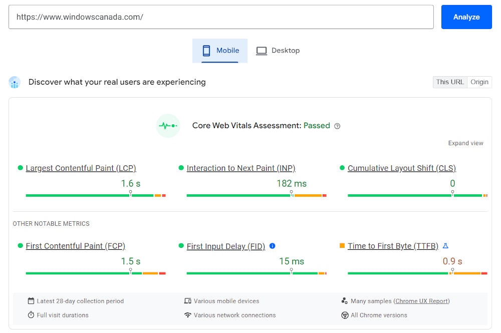
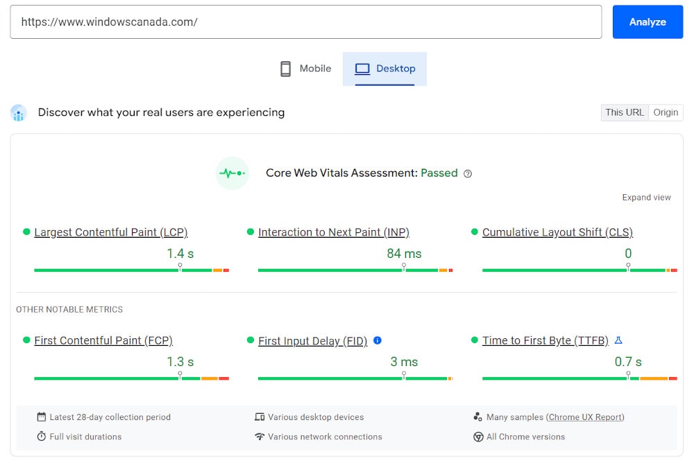
3. Speed Optimization: Page load time is a critical factor; slow websites deter users and increase abandonment rates, while streamlined code, optimized images, and proper caching can significantly enhance speed.
Mobile:
Desktop:
4. Mobile Compatibility: Given the prevalence of mobile usage, responsive design is non-negotiable. A seamless experience across all devices can significantly boost conversions.
Mobile:

Tablet:

Desktop:

How Optimal Web Design Extends User Interaction with Content
To maximize the time users spend engaging with content, consider the following design strategies:
- Interactive Elements: Incorporating interactive features like videos, clickable sliders, or hover effects can significantly increase engagement.
- Typography and Readability: Clear, easy-to-read typography with a logical layout and ample white space keeps users interested and makes content more accessible.
- Effective Calls to Action: Well-placed and clearly stated CTAs guide users toward desired interactions, enhancing engagement and potential conversions.
- Content Structure: Organizing content with logical headers, bullet points, and relevant images helps maintain user interest and facilitates easier consumption.
Mobile-first and Page layout
At the Mobile World Congress in 2010, Eric Schmidt, Google's CEO, said that designers should follow the "mobile first" rule in product design. Based on this rule, the Mobile-first index was created, which still influences website ranking today.
What is the essence of this rule, and how does the index work?
The Mobile-first rule concerns sites with adaptive design, which automatically rearranges the display of content depending on the screen parameters of the user's device. When creating a design, developers can go one of two ways:
- make a desktop version first, and then "cut down" by adapting the site to display on mobile device screens;
- start with a mobile version and then expand it to desktop computers.
In the first case, the mobile version is strongly inferior to the desktop version and can seem unfinished, imperfect, often inconvenient, and "diluted." Such a phenomenon is unacceptable, given that the number of mobile device users is constantly growing.
The Google Mobile-first rule says that developers should follow the path of "progressive improvement," starting to design for the mobile version and then improving it for the desktop PC.
A relevant index ensures that mobile users get relevant renditions for search queries, given the difference in content between desktop and mobile versions of a site. Mobile-first versions are subject to requirements, and penalties can be imposed for non-compliance.
Mobile-first requirements
- Presence on the mobile version of all critical content elements on the desktop version (video, text, images with alt descriptions).
- Structured data in both versions.
- Use of identical meta tags in both versions.
- Linking between versions remains unchanged. The valid rel=canonical and rel=alternate tags are suitable for this.
- For the hreflang attribute, you should specify links within the site's current version.
- The selected server should withstand the additional load of crawling (page crawling).
If you have considered all these requirements on your site, do not rush to celebrate victory - there is still another step.
Google introduced an improvement in the layout algorithm in 2012 that is relevant today. According to the developers, the introduction of Page layout should affect all positions by issuing at most 1% for all sites.
However, those who were "lucky" enough to get into this number will have to wait for the robot to re-scavenge pages to get out from under the sanctions. The only requirement is the algorithm Page layout - the absence of a large number of ads in the area of the site, which is accessible without the use of scrolling. This screen part must also not be cluttered with banners blocking access to the main content.
This requirement allows you to find the line between site owners' desire to make money from advertising and providing the visitor with a positive user experience.
What is the perfect web design?
You've probably noticed that the sites at the top of listings aren't always user-friendly, and they don't always have what you're looking for. At the same time, the very site that is convenient and beautiful was found through a long search on the network and carefully saved in your bookmarks.
Why does this happen? When developing a website, some developers focus on SEO optimization , which refers to the process of improving a website's visibility on search engine results pages, to the detriment of appearance and usability. The site is then accessible to promote, but not very convenient for visitors.
However, more attention should be paid to appearance and navigation. As a result, the web resource becomes convenient for users, even if they need help finding it.
Now that you're familiar with the search engine requirements for web design, it's time to ensure your site is user-friendly. Remember, user behaviour on your site can significantly impact its search engine ranking. To help you with this, we've prepared a practical checklist that you can use to evaluate and improve your website's usability.
Checklist
Our checklist for site usability is comprehensive, covering all the essential aspects of web design. By following this checklist, you can be confident that you're addressing all the key elements that contribute to a user-friendly website.
Download our Webpage Layout & SEO Design Checklist :
- Visual design is pleasing to the eye, involving thematic combinations of colours (no more than 4) and typography that compliments page design.
- No cluttered text or graphic information that is difficult to perceive.
- Correct display and usability from mobile devices are essential, along with a high page loading speed (1-2 seconds).
- Uniform style for all pages is important - the same header, slogan and menu on each page.
- Logos should be logical, clear, and clickable. When clicking on a logo, the visitor must be directed to the homepage.
- The typical location of each major element involves the logo on the top left, contacts on the top right, and the search bar in the header. In the footer, you should also be able to click a link that leads to the sitemap.
- Highlighting of links when a cursor is hovered over the hyperlink.
- A matching logo and site icon must be displayed in the browser tab.
- Highlighted call-to-action buttons, sufficiently placed on the site.
- A menu navigation must display the site's “standard" pages: “About the Company," “Product Catalog," “Reviews," etc.
- There should be a properly designed page 404: short text, identical design, contacts, and site search.
- The absence of elements such as broken links, inaccessible images & videos, unclickable buttons, and an abundance of pop-ups and media ads overlapping the main content.
- A secure HTTPS protocol.